HONEYBOOK
WHEN BUSINESS FLOWS YOUR WAY
INDUSTRY
Saas
B2C
SERVICES
Custom logo typeface
Logo motion design
Brand R&D
Colour treatment
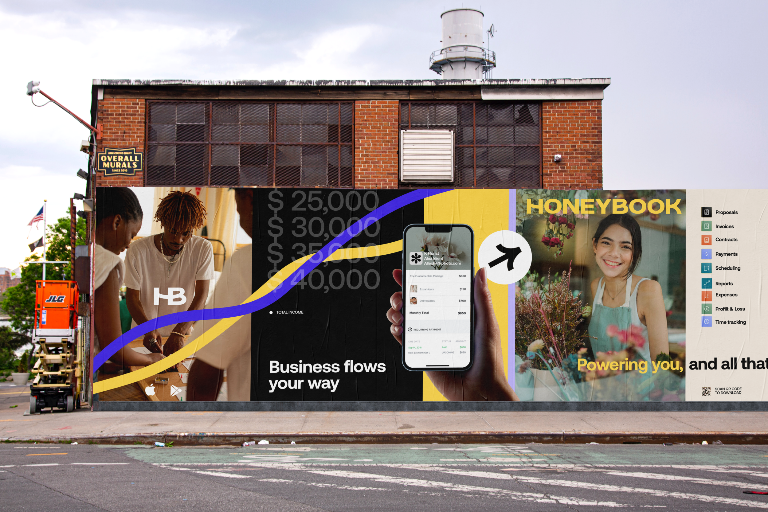
HRS created the new HoneyBook logo to be built around the concept of "clientflow" and the highly customised nature of an independent professional's process. As they move into the next phase of the company, the brand and logo had to embody a sense of robustness and establishment while also capturing the feeling of flow. The logo features customised characters that evoke the smooth and successful progression of a client project, from proposal to payment. A vibrant rebel yellow colour was carefully selected to ensure that HoneyBook stands out and catches attention. This combination of strength and fluidity in the logo reflects the company's maturity and reliability, while embracing its dynamic and agile nature.
As a unicorn in the industry, HoneyBook's status as a highly successful and valued startup is further reinforced. It was an exciting and enjoyable project that we played a major role in, collaborating with the local Company Policy Group for the brand's rollout. Together, we contributed significantly to shaping and implementing the new brand identity, ensuring a seamless and impactful reintroduction of the brand.
Collaborators
Motion • Matt Fowler & Jake Farmer
Type • Fostertype
Rollout • Company Policy


